Get inspired by some of the best email newsletter examples in the industry!
Gaining and maintaining a strong online presence is key for the long-term growth of every business, and newsletters are an important step in that journey!
In an era crowded with social media posts, the best newsletter emails offer a more intimate experience as they interact with each individual follower.
So if you are looking to build lasting relationships with your customers and strengthen your brand, let us show you the inspiring world of newsletters.
Increase traffic with the complete link in bio tool
Sign up for Feedlink – the best link in bio tool on the market.
What is an email newsletter?
Modern newsletters are marketing tools utilized by businesses and organizations to inform their network of users and prospective customers about the latest happenings surround their products and services and the industry in which they operate.
As such, email newsletters help you forge a stronger bond with your audience as you become a consistent presence in their inboxes with your various exclusive insights, tips, and promotions customized for the individual who receives them.
In essence, you are sending them a focused conversation starter to nurture brand loyalty instead of another post lost in the chaos of social media.
So, in addition to learning how to start a blog for your small business in 2024, you should also look into creating your first email newsletter as soon as possible.
Email newsletter ideas for small businesses
Before diving into our fantastic list of newsletter examples, let’s check out a few newsletter templates that you can use for your different target groups:
For lawyers:
Content Focus: Share summaries of recent articles, blog posts, legal updates, and case studies, or provide answers to frequently asked legal questions.
Impact: This approach establishes your authority in the legal field, keeping clients informed about relevant legal changes and demonstrating your expertise.
For real estate agents:
Content Focus: Provide homeowners with guidance on property upkeep, renovation suggestions, and effective methods to improve the value of their homes.
Impact: You assist clients in making informed choices about their properties, establishing yourself as a trusted and indispensable advisor in the real estate industry.
For shop owners:
Content Focus: Announce new product launches, showcase unique features, or offer exclusive deals and previews.
Impact: This way, you keep your audience engaged and excited about your brand identity and offerings, potentially increasing sales and customer loyalty.
For technology service providers:
Content Focus: Share tech tips for easier product usage, reviews of new gadgets, or insights into emerging technology trends.
Impact: This positions you as a go-to source for tech knowledge, helping clients stay ahead of the curve with the latest technology.
What’s the goal?
Regardless of the industry you’re in, your weekly newsletter should provide unique insights and tips that will genuinely help your customers in their day-to-day lives.
That way, you strengthen your connection with them and nurture a genuine sense of community of both informed and engaged readers and customers.
Top 13 email newsletter examples for business owners
If you tried, you’d find all sorts of newsletters as businesses implement different promotion techniques depending on their target groups and marketing goals.
From aesthetic sale updates to well-organized law advice, check out 13 sample newsletter examples that achieve their purpose: become a versatile instrument for capturing the public’s attention and bringing in loads of new followers and loyal customers.
Example #1: Stitches N’ Giggles (newsletter example for company news and regular updates)

For DIY enthusiasts, Stitches N’ Giggles is a top-notch creative crafts firm that produces an engaging weekly newsletter filled with tips, tricks, and unique offers.
What we like about this newsletter:
- The Stitches N’ Giggles newsletter excels in design elements creating a warm, welcoming atmosphere that seems to extend their in-store hospitality to the online realm:
- The personal touch is evident in the ‘About us’ section, where they introduce the family behind the business, fostering a connection often missing in digital communication. This approach makes the newsletter feel like an extension of their customer service:
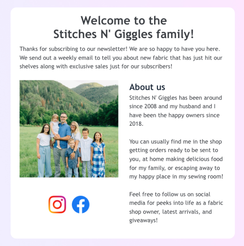
- Additionally, the visually appealing layout showcases the colorful array of products effectively, with clear, engaging sections that invite the reader to explore more:
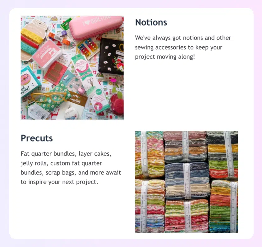
- With its lively and captivating style, Stitches N’ Giggles’s newsletter example catches the eye of readers and offers a joyful tour through a gorgeous world.
Best used for:
- This newsletter model is great for announcing new products, special pricing tiers, and even community engagement through social media channels.
- The structure promotes regular interaction with customers, encouraging them to take advantage of sales while keeping them informed about the business’s offerings. It’s a multifunctional tool that builds a loyal community around the brand.
Example #2: MoveU (newsletter example for educational content)
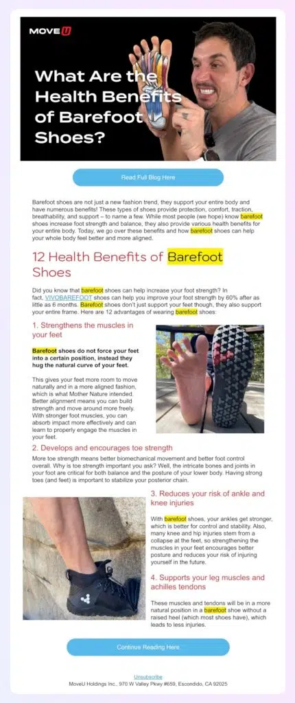
MoveU is a small business company that provides services in the fitness and health industry. Their focus is on the benefits of daily movement, reflected in the name itself MoveU.
What we like about this newsletter:
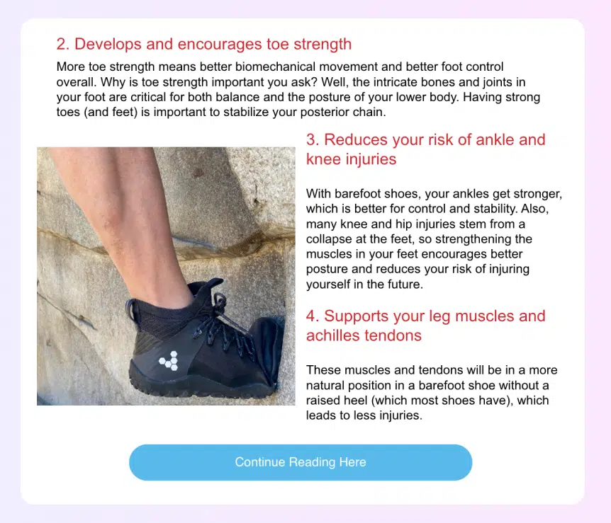
- The MoveU newsletter seamlessly merges educational material with the brand’s marketing agenda. The striking high-quality images not only grab the reader’s attention but also emphasize the textual content, making the information digestible and memorable.
- The content is organized well, and the prominent CTA nudges the reader toward the company’s blog for in-depth information. This approach strategically drives web traffic without overwhelming the newsletter with text, making it concise and focused:
Best used for:
- This newsletter style is ideal for small health and fitness companies wishing to combine relevant educational content with product/service promotions.
- It’s perfect for a local gym announcing a new workout regimen or for a dietitian offering a preview of a new nutrition plan. The newsletter provides valuable information in an easily consumable format, encouraging readers to engage further with the business.
Example #3: Meow Meow Tweet (newsletter example for eco-friendly brands)

Meow Meow Tweet is a conscientious brand that crafts natural, vegan skincare products with a strong commitment to sustainability and eco-friendly practices.
What we like about this newsletter:
- Meow Meow Tweet’s newsletter features a clever combination of product highlights and educational content on natural skincare. Plus, it’s thoughtfully designed with a soft pink palette to reflect the brand’s gentle approach to skincare and the environment.
- An enticing offer of a 10% discount on the first order is a great welcoming present. The promise of exclusive deals keeps readers engaged as well. The inclusion of charming pet-friendly GIFs adds a playful touch that’s likely to resonate with the target audience, who presumably share the brand’s love for animals and clean living.
Best used for:
- This newsletter template is an excellent resource for emerging businesses looking to carve out a niche in the natural living market. The balanced layout, which combines engaging content with product showcases, serves as an ideal framework.
- Suitable for brands that want to highlight their commitment to environmentally conscious practices such as a startup offering eco-friendly home goods or a small boutique focusing on organic clothing, both of which want to impart modern values.
Example #4: Molly Moon (newsletter example for fostering a community)
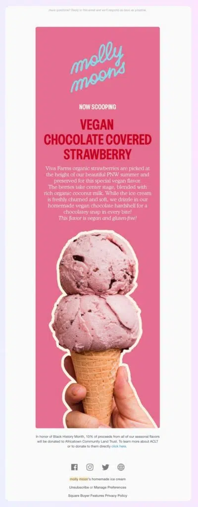
Molly Moon’s Homemade Ice Cream is a charming boutique ice creamery in Seattle, renowned for its artisanal, delectable ice cream that delights with every scoop.
What we like about this newsletter:
- Molly Moon’s newsletter is the cherry on top of your inbox sundae, bringing a monthly dose of joy.
- The newsletter features an engaging story about the brand’s strawberry flavor, complemented by an enticing image of the ice cream, that’s almost as good as tasting it.
- The tone is eco-friendly and warm, much like a recommendation from a trusted friend who cares about the planet as much as they care about flavor.
Best used for:
- Molly Moon’s newsletter example is a scoop of ultimate flavor-packed inspiration for small businesses aiming to foster a vibrant community.
- It’s like the secret ingredient for turning subscribers into lifelong fans—essential for every new business owner looking to make their mark!
Example #5: Bloomscape (newsletter example for exclusive deals)
Bloomscape is a business that brings greenery into people’s homes with its selection of easy-care indoor plants that fit great into any scenery.
What we like about this newsletter:
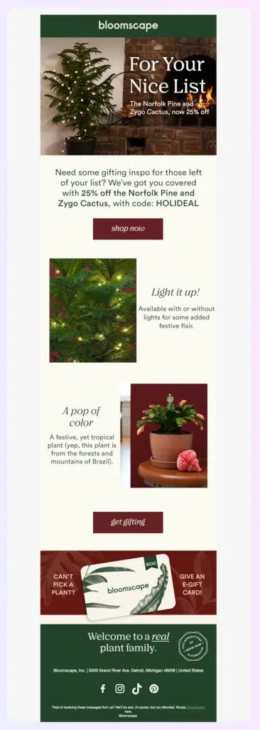
- Bloomscape’s holiday newsletter examples exceed each subscriber’s expectations by filling up their inbox with an offer that’s hard to refuse.
- Each monthly newsletter is filled with helpful content and thoughtful product suggestions based on the season. This is one of the many newsletter examples that are filled with a burst of vibrant plant photos, making the reader feel like each one of them could be a potential addition to their home jungle or a gift to a loved one during the holiday season.
- Additionally, notice how they’ve smartly included multiple call-to-action buttons with different copy but the same intent (purchasing one of their plants).
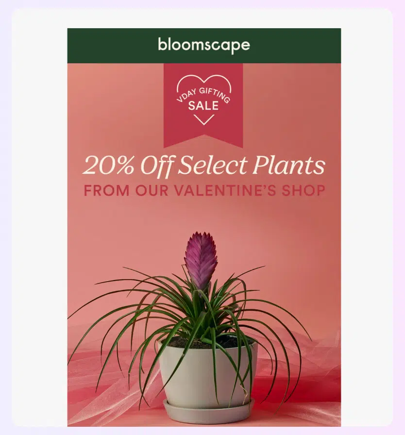
Here’s another example of how they leverage seasonal trends to their benefit throughout the year:
Best used for:
- This newsletter is a template for businesses looking to create a bond with their clients through a vibrant yet smart showcase of products and clever wordplay.
- On top of this, it demonstrates how to nurture a brand community with relevant content and exclusive deals all during the year and turn it into an advantage.
Pro tip: Notice how they’ve also added a link to their social media accounts to encourage subscribers to visit their social media channels (making their newsletter not only part of their email marketing efforts but also their wholesome digital marketing strategy.
Example #6: Function of Beauty (newsletter example for personalized beauty product marketing)

Function of Beauty is an e-commerce brand specializing in haircare, offering a personalized touch to every shower routine by tailoring products to meet individual hair needs.
What we like about this newsletter:
- A perfect blend of visuals and minimalistic structure through readable bullet points.
- Functions of Beauty’s email design is split into two parts. The first part shows a cool picture full of products in a soft color palette, getting readers excited. Then, in the second part, they sum up all the important info about their best discount offers.
- Instead of overwhelming their customers with a lot of text, the content’s simplistic expression gives the reader just enough data for him/her to click on the main CTA at the end.
Best used for:
- This monthly newsletter example is a must-see for health and wellness studios looking for inspiration to create their own personalized and effective email design.
- Utilizing the perfect blend of colors and animated GIFs, they can capture the ideal audience’s attention and encourage engagement.
Example #7: CookSmarts (newsletter example with an ebook offer)

CookSmarts is a meal planning and recipe service designed to make cooking at home more convenient, enjoyable, and straightforward to the point that anyone can do it.
What we like about this newsletter:
- What sets it apart is the illustration with an embedded CTA button to download an illustrated ebook for 10 delicious instant pot recipes.
- The image aside, the newsletter also has a straightforward structure offering several additional resources on home cooking that will help readers immensely.
- At the end of the day, its friendly and approachable tone feels like you are getting your cooking tips from your friend over the phone. It’s tasty and down to earth.
Best used for:
- Visually simple, straightforward, and easy to read—this newsletter example is ideal for businesses who want to communicate with customers in a non-complicated way.
- That way, businesses can get straight to the point and share valuable content with their readers without too many distracting visual elements.
Example #8: GhostBed (newsletter example for tech-savvy businesses)

GhostBed is a business offering bigger, better, and more affordable mattresses, bed frames, sheets, and pillows. Their 101-night mattress sleep trial, free shipping, hassle-free returns, and easy online shopping set them apart from the competition.
What we like about this newsletter:
- Starting from the heading and preview text, all the way to the layout, this newsletter example screams boldness and tech-savvyness. It has everything: images in combination with product GIFs, benefit-oriented copy, and detailed product features.
- On top of that, the brand is highlighting its commitment to customer service by stating its constant availability. Additionally, they provide solid social proof by claiming they’ve received over 60,000 positive reviews, further establishing their credibility:
Best used for:
- The GhostBed newsletter is best utilized in scenarios where engaging and retaining customers is key to the success of the business.
- It’s ideal for businesses that are looking into launching new products with special promotions, or campaigns aimed at highlighting unique product features.
- Additionally, the inclusion of customer testimonials and emphasis on always-available customer service makes it suitable for building brand trust and loyalty.
Pro tip: if you do go with such tech savvy newsletter example for your company, make sure you have all the resources and tools you need to not only launch a single e-mail but scale and grow entire newsletter marketing campaigns.
Example #9: Busboys and Poets (newsletter example for building a community via events)

Busboys and Poets is a restaurant, bookstore, and cultural hub located in the Washington, D.C. Metropolitan area. The establishment often hosts poetry readings, book clubs, and discussions, making it a cultural and community-oriented space.
What we like about this newsletter:
- This email newsletter stands out with its remarkable range of options and diverse topics covered!
- Right from the very start of the email, subscribers are intrigued by the range of choices—from art, film, and books to open mics and talks, the newsletter encourages readers to participate in the many events offered by Busboys and Poets.
- In this email, they provide information about all upcoming events which are divided into different sections (book, poetry, screenings, etc.), while also showcasing photos of their speakers and Saturday/Sunday food brunches. Plus, they put CTAs for each choice and make it even more tempting for readers to click on their red buttons.
Best used for:
- This newsletter is ideal for businesses aiming to blend creativity with commerce. It showcases a unique, innovative approach, effectively merging artistic elements with clear, structured information about upcoming events.
- This approach is highly effective for growing a community and expanding small business ventures. It provides a compelling template for businesses seeking to engage their audience through aesthetic appeal and informative content.
Example #10: Wolf & Moon (newsletter example for jewelry marketing)
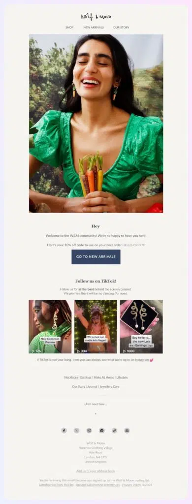
Wolf & Moon is a boutique known for its modern, elegant jewelry, offering unique necklaces and eye-catching earrings. It’s a top choice for those who love distinctive accessories.
What we like about this newsletter:
- Below their stylish and simple logo, Wolf & Moon have included high-quality, vibrant images showcasing their latest jewelry. On top of that, right from the start, they captivate new subscribers with a 10% discount, making their unique offering instantly enticing.
- The newsletter’s design combines varied colors, engaging TikTok videos, and straightforward call-to-action (CTA) prompts. This blend of minimalism and elegance is effective in drawing in jewelry lovers and encouraging subscribers to become part of their community.
Best used for:
- This newsletter is an excellent example for jewelry businesses looking to keep their customers updated on the latest trends in accessories.
- By showcasing cool, trendy designs, it simplifies the shopping experience, enabling customers to easily pick their favorites. This strategy is effective in ensuring customers find what they are looking for, enhancing satisfaction and engagement.
Example #11: Maisonette (newsletter example for toy store marketing)

Maisonette offers a product collection from kids’ brands and independent boutiques, including clothing, toys, gear, furniture, and home decor for babies, kids, and moms.
What we like about this newsletter:
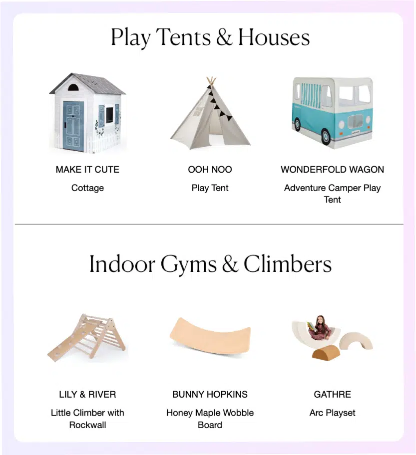
- The newsletter from Maisonette presents a clean and inviting design that effectively showcases a variety of children’s toys and furniture.
- The imagery is clear and engaging, promoting products through well-organized sections that highlight their appeal. The use of white space around the items makes the newsletter feel uncluttered, enhancing the overall visual experience:
Best used for:
- This newsletter is excellently suited for retail businesses in the children’s sector looking to advertise a range of products in a concise and visually appealing manner.
- It serves as a great example for businesses that want to spotlight new arrivals or featured items, encouraging customers to explore the latest offerings with ease and comfort.
Example #12: Otherland (newsletter example for home fragrance marketing)
Otherland is a fragrance brand that creates immersive experiences in customers’ homes with its enticing fragranced candles and perfumer-crafted scents. Their point of differentiation is that they offer five unique scents that are free of parabens and phthalates.
What we like about this newsletter:
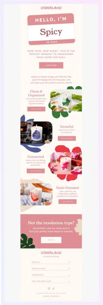
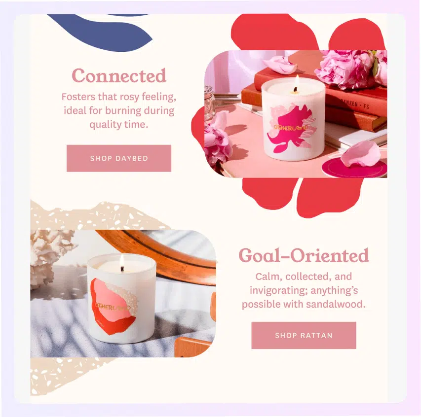
- The Otherland newsletter is visually appealing with its pastel color palette, invoking a sense of luxury and calm.
- The images are crisp and engaging, and the layout is clean, allowing each product to stand out with its unique description:
Best used for:
- This newsletter template is a valuable tool for businesses in the home fragrance or luxury goods sectors looking to market new products with a fresh and modern twist.
- It’s especially suitable for launching a new line or collection at the start of the year, capitalizing on the theme of transformation and new beginnings.
- The design and content strategy could be effective in capturing the attention of customers who appreciate elegance and sophistication in their purchases.
Example #13: Peach & Lily (newsletter example for skincare education)

Peach & Lily is a Korean beauty brand that offers 100% worry-free vegan and cruelty-free skincare products. Their products are designed for anyone looking for high-quality skincare with formulas that deliver big results without harmful ingredients.
What we like about this newsletter:
- The Peach & Lily newsletter utilizes a clean, structured format to debunk common skincare myths, educate consumers, and subtly showcase their products.
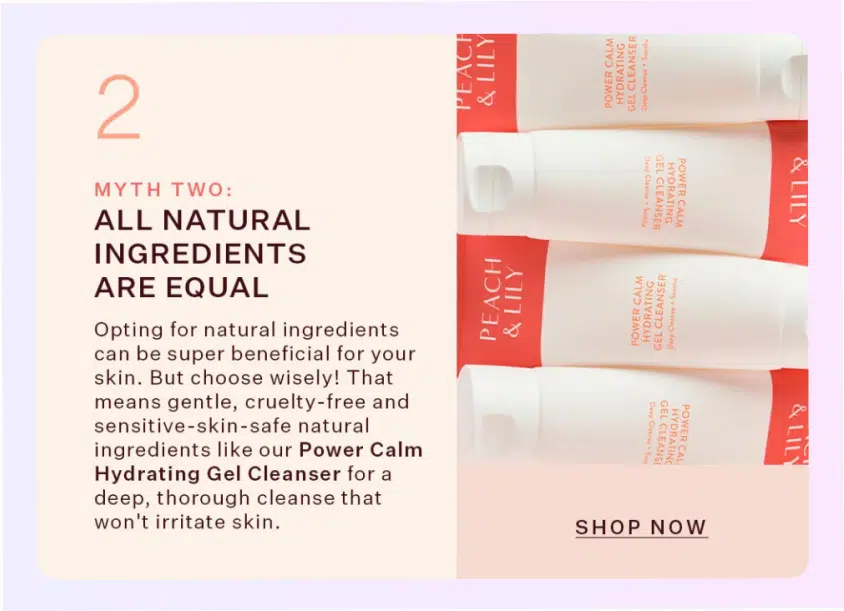
- The use of authentic images of smiling faces helps to create a sense of trust and relatability, while the simple color scheme keeps the focus on the content and products.
Best used for:
- This newsletter is perfect for beauty and skincare brands aiming to inform and engage customers by busting myths and promoting informed choices.
- It’s a clever way to combine education with marketing, thereby encouraging purchases through increased product understanding and trust.
Email marketing newsletter design
When designing a newsletter, you should think about more than its visuals. At the end of the day, your newsletter is a tool to drive action and business growth. With that in mind, here are a few best practices for making an appealing and effective newsletter:
- Use a layout optimized for different devices—make sure your newsletter’s layout is clean and uncluttered, adapting easily to different screen sizes and devices (phones, desktops, and tablets). This enhances readability and user experience;
- Use engaging visuals and readable fonts—select high-quality images and easy-to-read fonts that are aligned with your brand’s style;
- Remain consistent with your brand—incorporate your logo and maintain consistent branding throughout the newsletter to strengthen brand recognition;
- Implement clear CTA buttons—your CTA buttons should guide your readers on what to do next, whether it’s to purchase a product, read a blog post, or put in their personal email address. Make sure all of them are aligned with the single goal you have for your business;
- Organize content effectively—make sure your e-mails have a clear structure, which is achievable by using headings and subheadings. This makes it easier for readers to scan through the newsletter and find what’s relevant to them;
- Provide an ‘unsubscribe’ option—you must always include an easy way for subscribers to opt out. Placing an unsubscribe link it’s not just good practice; it respects subscriber preferences and complies with email marketing regulations;
- Remember the footer—include essential contact details in the footer, such as links to your social media profiles and contact information.
By integrating these elements into your email template and newsletter design, you can create a visually appealing, user-friendly, and effective email marketing tool. Keep testing different designs and content strategies to see what works best for your community.
Want to learn more? “How to Make a Newsletter in 9 Steps to Grow Your Small Business” is an article that takes you through the entire creation process.
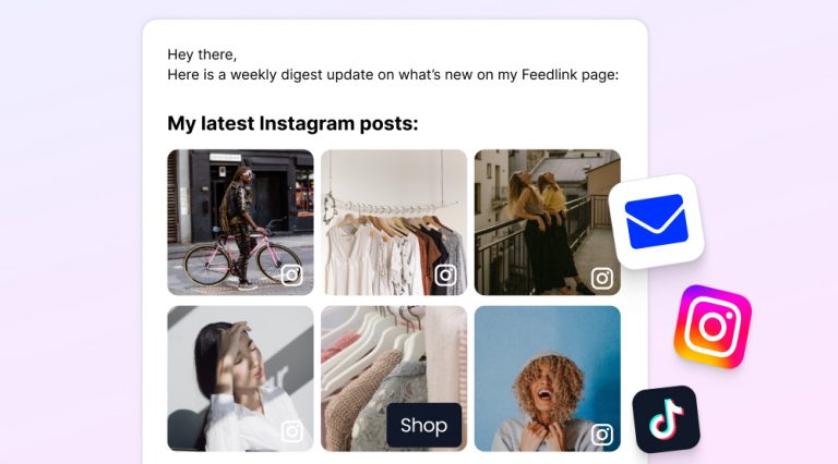
Crafting an automatic weekly newsletter with Feedlink
Naturally, when designing your newsletter you will look into several tools and platforms to help you do that. That said, you shouldn’t overlook Feedlink—a small website builder with a great newsletter feature that helps you build compact and effective newsletters!
However, before creating your newsletter, you have to sign up for a free 7-day trial, build your first Feedlink page, and connect your Instagram and TikTok accounts.
Then, you have to follow a few simple steps:
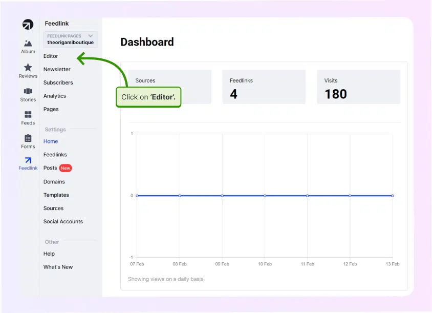
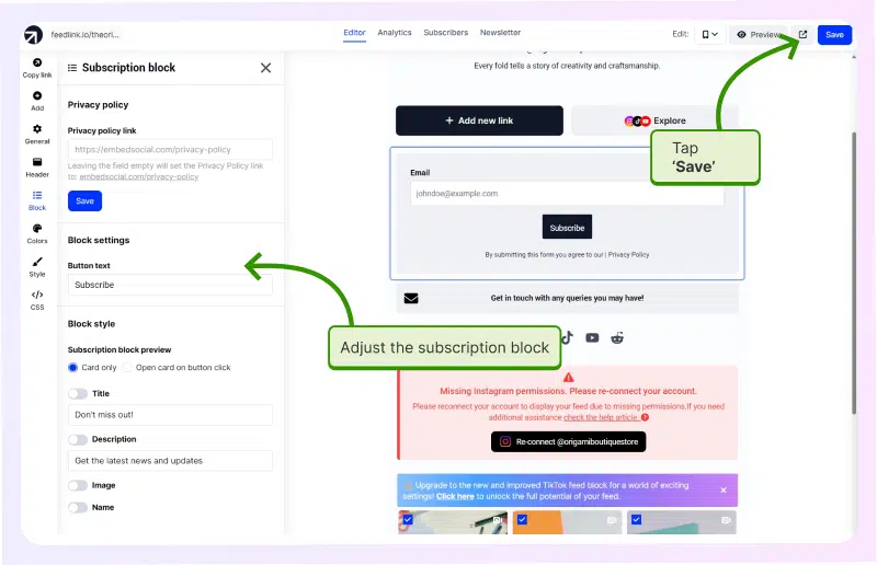
Step 1: Log into your Feedlink dashboard and go to ‘Editor’;
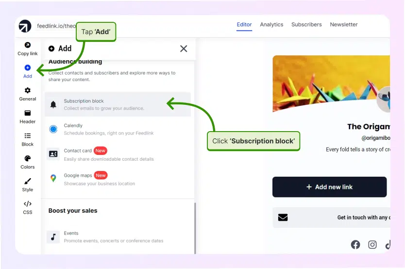
Step 2: Select ‘Add’ from the left-side ribbon and tap ‘Subscription block’;
Step 3: Set up the block and click ‘Save’ to start building your subscriber list;
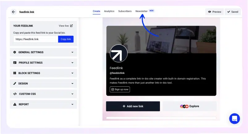
Step 4: Go to the ‘Newsletter’ tab located at the top of the page;
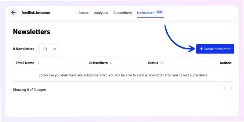
Step 5: Click ‘Create newsletter’ (active only if you have at least one subscriber);
Step 6: Choose the weekly mailing time and tap ‘Set live’;
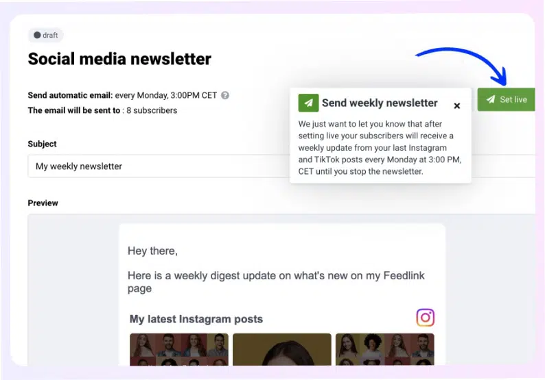
Congrats! You’ve just created your first automatic social media newsletter that will pull in and mail out your best Instagram, TikTok, and blog posts every week!

Increase traffic with the complete link in bio tool
Sign up for Feedlink – the best link in bio tool on the market.
Conclusion
All these examples of newsletters show us that they can be a powerful tool for small businesses looking to engage customers and showcase products.
Whether you’re aiming for an elegant touch, a playful vibe, or an educational approach, the key is to keep it visually appealing and content-rich.
Remember: create newsletters that catch the eye, inform, and inspire action!
So, take these insights, get creative with your weekly newsletters, and watch your community and business grow. Good luck with your very own newsletter!
FAQ
How do I start my first newsletter?
Typically, starting your first newsletter involves choosing a reliable email marketing platform, defining your target audience and newsletter goals, and designing a visually appealing template that reflects your brand. It’s important to provide valuable content that resonates with your audience’s interests to encourage sign-ups and engagement.
How do I collect subscribers?
To collect subscribers, create a compelling signup form and place it prominently on your website, blog, and social media platforms. Offer incentives such as free resources, exclusive content, or discounts to encourage sign-ups. Ensure transparency by clearly stating the benefits of subscribing and respecting privacy and data protection laws.
What does a good newsletter look like?
A good newsletter is visually appealing, reader-friendly, and provides valuable content tailored to the interests of its audience. It should have a clear, consistent layout, engaging images, and compelling headlines. Regularity in sending, personalization, and segmentation can enhance its effectiveness and reader engagement.
How do you write catchy subject lines for a newsletter?
Writing a catchy subject line for a newsletter involves using persuasive and action-oriented language, personalization, and creating a sense of urgency or curiosity. Keep it short and to the point, ensuring it accurately reflects the newsletter’s content. Testing different subject lines can help identify what resonates best with your audience.
